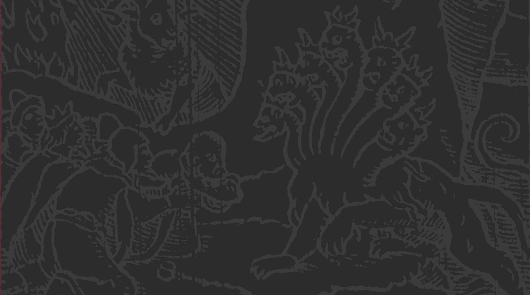
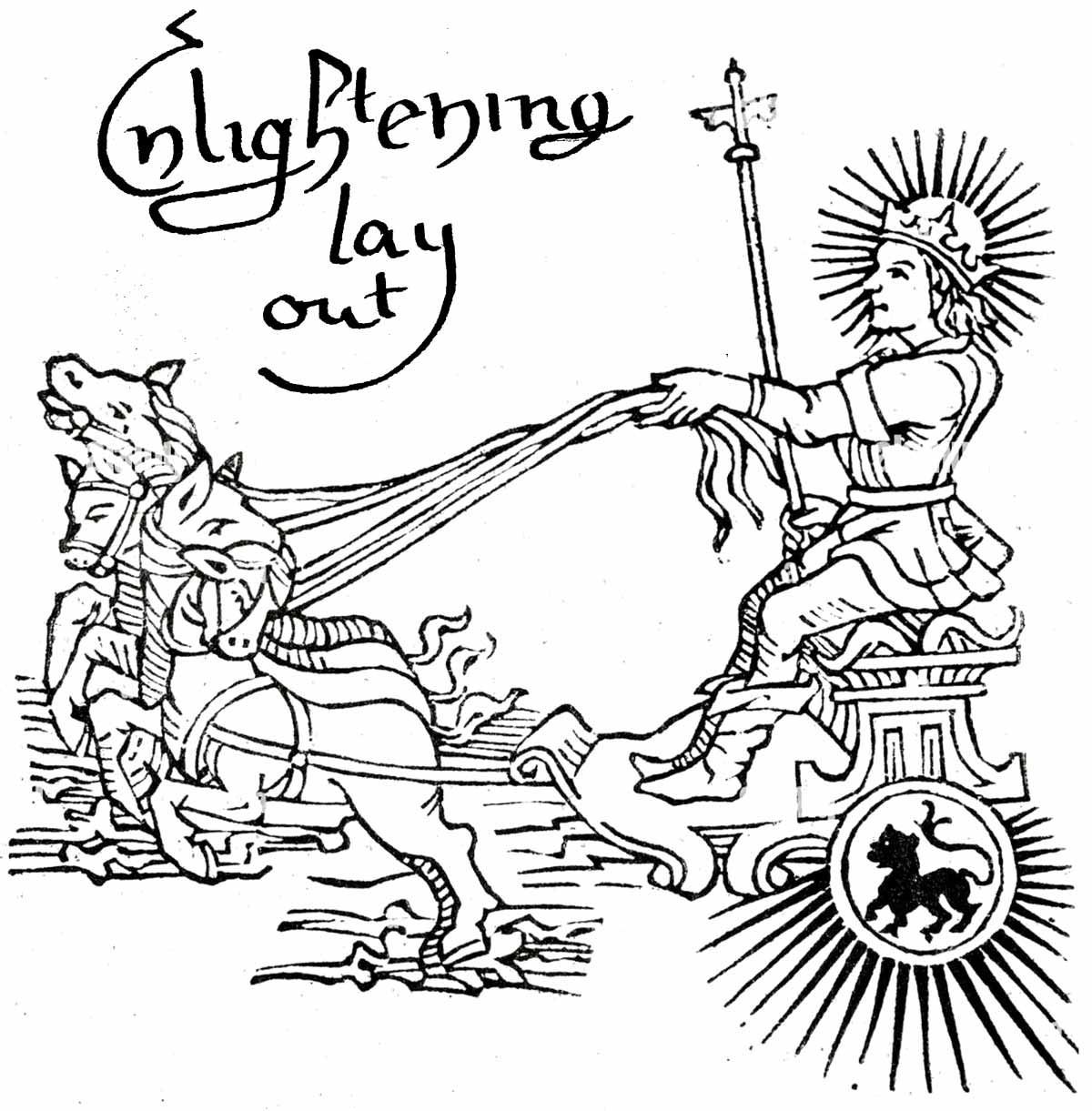
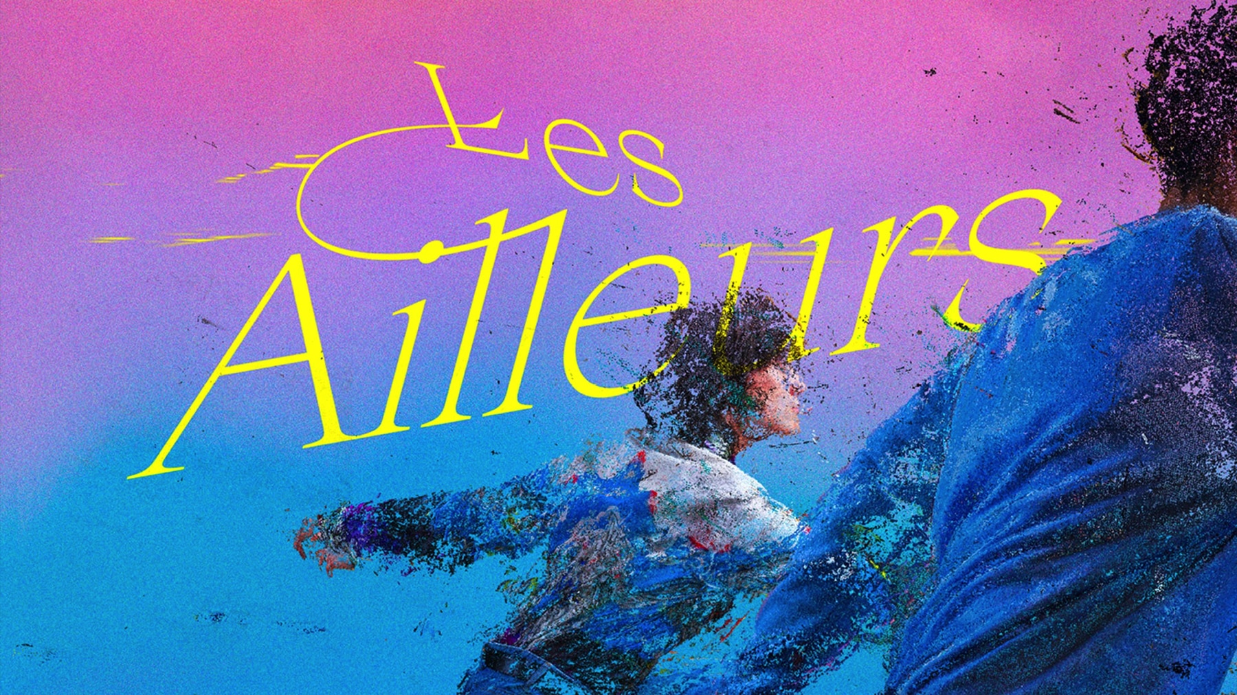
Apoc(alypse) character set & alternates was released in 2018 and updated in 2020 & 2022 by Matthieu Salvaggio. Cyrillic languages was designed by Ilya Ruderman (Tomorrow Type). Defined by designers as the most popular typeface of contemporary independant design, Apoc is an elegant, expressive font family, perfect for bold designs focusing on heavy font uses.
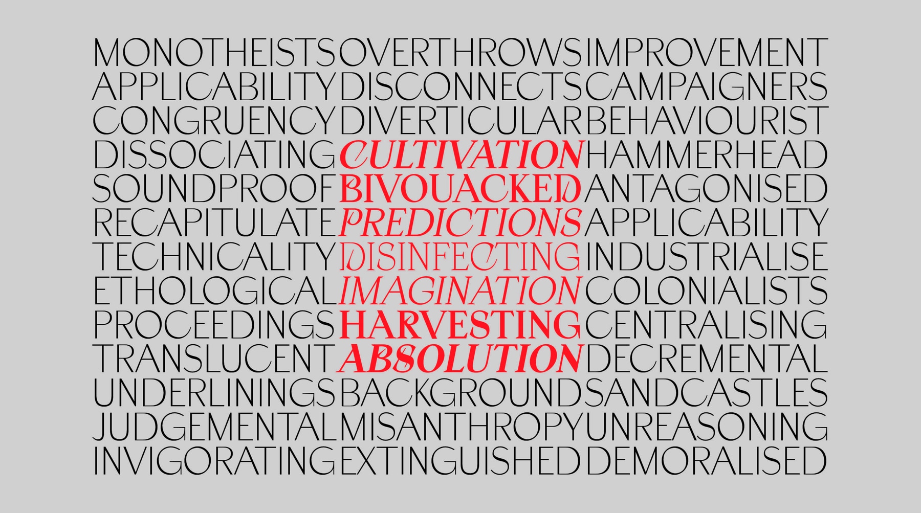
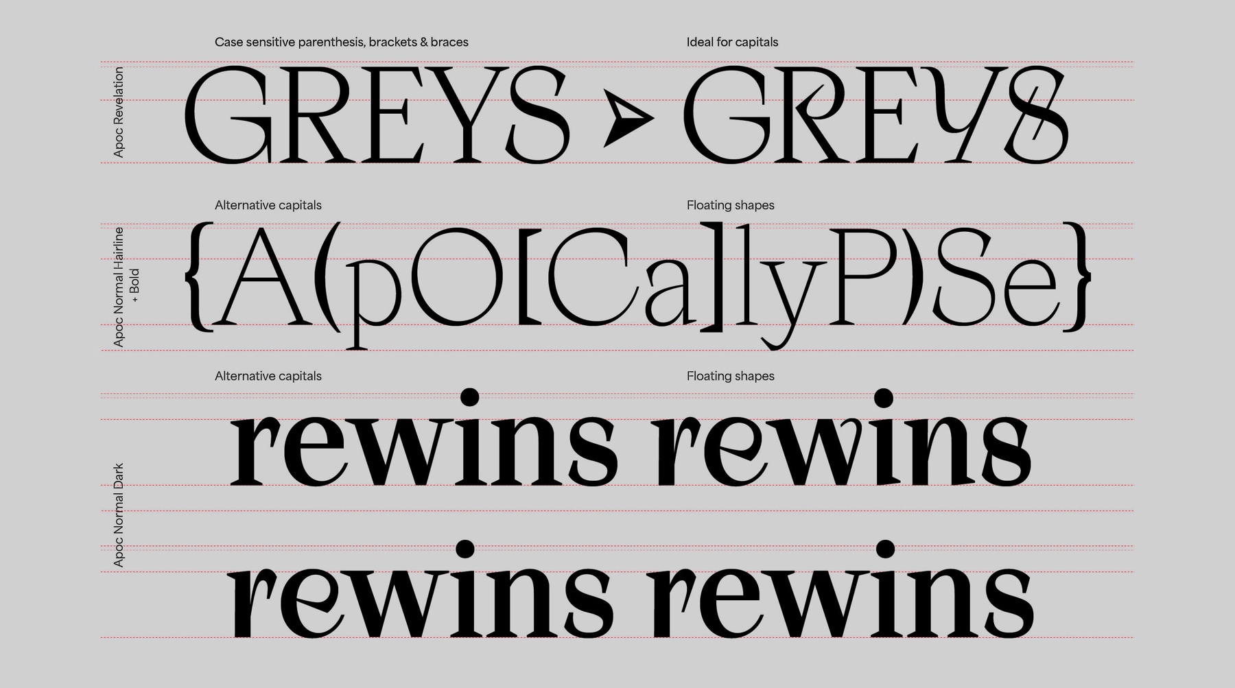
Apoc is an elegant, expressive font family, perfect for bold designs focusing on heavy font uses.
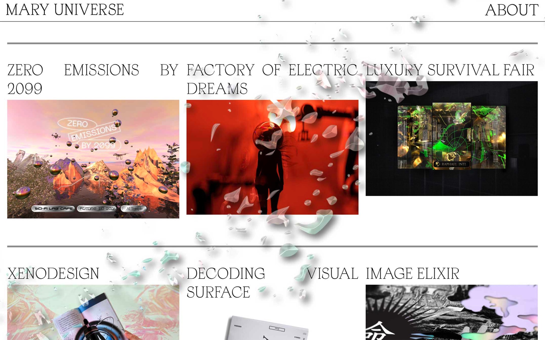
Apoc is an elegant, expressive font family, perfect for bold designs focusing on heavy font uses.
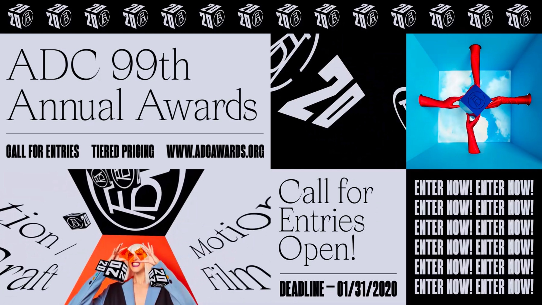
Apoc is an elegant, expressive font family, perfect for bold designs focusing on heavy font uses.
- Designed by
- Matthieu Salvaggio, Tomorrow Type
- Released in
- 2018
- Updated in
- 2020, 2021, 2022
- Export
- .OTF .WOFF .WOFF2 .TTF (Variable)
- Developed for
-
Latin European and Cyrillic
 Abaza, Abkhaz, Adyghe, Afar, Afrikaans, Aghul, Albanian, Altai, Aranese, Aromanian, Avar, Aymara, Azeri (Cyrillic), Azeri (Latin), Balkar, Bashkir, Basque, Belarusian, Bemba, Bislama, Bosnian, Breton, Bulgarian, Buryat, Catalan, Chamorro, Chechen, Cheyenne, Chichewa, Chokwe, Chukcha, Chuukese, Chuvash, Cofán, Cornish, Crimean Tatar, Croatian, Czech, Danish, Dargin, Dolgan, Dungan, Dutch, Enets, English, Esperanto, Estonian, Even, Evenki, Faroese, Fijian, Finnish, French, Frisian, Friulian, Ga, Gagauz, Galician, Ganda, German, Gikuyu, Greenlandic, Gwich’in, Haitian, Hawaiian, Hungarian, Icelandic, Ido, Igbo, Indonesian, Ingush, Interlingua, Irish Gaelic, Italian, Itelmen, Javanese, Kabardian, Kalmyk, Karakalpak, Karelian, Kashubian, Kazakh, Khanty, Kildin Sami, Kinyarwanda, Kirghyz, Kiribati, Kirundi, Kituba, Komi, Kongo, Koryak, Kumyk, Kurdish, Kwanyama, Ladin, Lak, Latvian, Lezgian, Lingala, Lithuanian, Luxemburgish, Macedonian, Malagasy, Malay, Maltese, Manci, Maninka, Manx, Māori, Mari, Marshallese, Moldovan, Mongolian, Montenegrin, Mordvin (Erzya), Mordvin (Moksha), Náhuatl, Nanai, Nauruan, Navajo, Ndebele (Northern), Ndebele (Southern), Nenets, Nganasan, Nivkh, Nogai, Norn, Norwegian, Nyanja, Occitan, Oromo, Ossetic, Otomi, Palauan, Pedi, Polish, Portuguese, Quechua, Rarotongan, Rhaeto-Romanic, Romaji, Romani, Romanian, Russian, Rusyn, Rutul, Sámi (Inari), Sámi (Lule), Sámi (Northern), Sámi (Southern), Sango, Sardinian, Scottish Gaelic, Selkup, Serbian, Seychelles Creole, Shona, Silesian, Slovak, Slovene, Somali (Latin), Sorbian, Sotho, Spanish, Swahili, Swati, Swedish, Tabasaran, Tagalog (Filipino), Tahitian, Tajik (Cyrillic), Tatar, Tetum, Tok Pisin, Tokelauan, Tongan, Tsonga, Tswana, Turkish, Turkmen, Tuvan, Twi, Udmurt, Ukrainian, Umbundu, Uzbek, Venda, Veps, Welsh, Wolof, Xhosa, Yakut, Yoruba, Zulu